At the very beginnning of this project, I try to do some researches about the 09/10 color trend forecast.
The first theme that I have found is some bright and cheery polychromatic mood.
Some of them are Housse, Mixeur,, Sirop, Lino. It gives us funny feeling.

Another theme is coming from the inspiration of some fresh and juicy fruits.
The fruits become all dark tones, look savory.
Say Cacao, Liqueur, Sureau, Tonka
In our group, the research from the previous to the latest of Marni's collection, they are also using the achromatic scheme and neutral scheme mixed with analogous scheme or double complimentary color schemes.
So, in my forecasting of Marni color theme, I would obtain these two color themes.
In the s/s 09 of the Marni, it uses a contrast of pastel colors with achromatic colors. And high chroma color with some interesting print such as, blurry checks, painterly abstracts, harlequin lozenges, and splashy fifties flowers.
From my point of view, this can provide a clear, even contrast and happy mood.
Color trend of Marni F/W 09/10

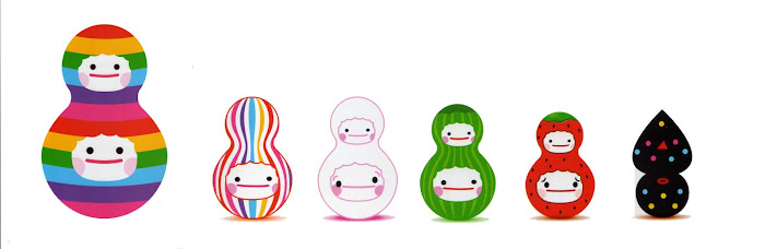
My color theme is called “juice doll”, some of the colors combination look like a food, a toy, when you see it, you want to eat them, and enchanted by it.
In the color theme, analogous color schemes,
analogic and complimentary color scheme will be used.
The high chroma with contrast of value, the royal blue, and raspberry rose, midnight navy and yellow, poison apple. It is the basic color, and mixed with achromatic color.
While you wear the Marni collection, It can give you a funny time and happy mood all the days
Marni color develpment - color pen drawing


In the first stage, I use the color pen to draw it and for development.
I try to use analogic and complimentary color scheme, and apply the different patterns. It will use Analogous Color Combination to create some pattern, for instance the checks, strips.
The second stage I try to use the Photoshop to fill the color.
Outfit 1.

The first outfit I try to create is a pattern using achromatic color mix with dark color, or complimentary color scheme. The pattern will be applied on the pants.

When I combine the color to create a pattern, I look at the color raspberry rose and yellow mix with pattern which have a secondary color effect.
Outfit 2.

The second outfit, I would like to fill the dark color on the bodice with some high chroma.

And then I draw two strips on the bodice, this time I also use analogic and complimentary color scheme. And the bodice some use Analogous Color Combination.

Then I create some different strips to apply on bodice, and use Triadic Color Scheme.
Afterwards, I find that apply some strips on bodice, the mood come out is not relate the theme. Because many dark colors in one pattern.

I try to fill pattern on the neckline part. It is use the second development to fill the pattern.
3.Outfit

The third outfit I try to fill the pattern on the scarf and some on the legging, and it is use achromatic color in the legging part with Analogic Color Scheme.


Then I fill the pattern at bodice and the upper bodice part dark color and constant chroma. The dress is use high chroma.
The forth and fifth outfit it is also use analogous and complementary color schemes.
4.Outfit


The forth outfit, fill the Monochromatic Color Scheme pattern on the shirt, it has volume effect, and use the high chroma color has different contrast, but in the same fill in the dress, it not to much effect to come out.
5.Outfit


And the fifth outfit it tries to fill an achromatic on the shirt, but the mood a come out not match the theme. And I will try to use a Triadic Color Scheme.
The last 5 outfit
After I finish filling all outfits, i choose 5 the best in the development. All outfits it has fill the pattern, and mix with the total outfits it is use analogous and complimentary color scheme.

Totally there are 5 outfits, I try to use the high chroma color on the upper pattern. And the lower part, legging and shoes are using a dark color, it can balance the color and have contrast.
Before mention about the Marni summer 09 collection, it uses a lot of pastel color, but in the fall/winter 09/10, I try not to use those colors on the outfits. As I think in the winter the color shades can increase and also can keep the high chroma color.
This can also express the Marni happy mood in the fall/winter collection.


 Have largest opera houses are the 19th century opera garnier and opera bastille.The former tends towards the more classic ballets and operas, and the latter provides a mixed repertoire of classic and modern.Theatre traditionally has occupied a large place in Parisian culture until hols true today.
 You will see many cafe in Paris, because coffee is well-known in Paris
 China is renowed as a land of tea drinks.
 They also dress in high chroma, because they want become a focus in the all people.
 Some older they will also dress in monochromatic color schemes.


 Some working class people need to wear a simple color, it is because suitable for there work.
 Men prefer to wear achromatic color schemes and no chroma.
 Men style become colorful, bright color, high chroma and look casual .
 Women style is use hot color , it is relate the chinese traditions , red color is represent good luck.